Monday, January 31, 2005

More on Photos with GPS Coordinates

Ricoh just a week or so ago announced a GPS-ready camera called the Ricoh Caplio Pro G3, which is also OS X ready as you can download OS X software from Ricoh's downloads page.


Engadget is claiming that this is a bunch of hype, as the Ricoh Caplio Pro G3 has been released before and this "new" camera is no different. It sounds to me as if the marketing momentum petered out and Ricoh is trying to pump things up again, which I'm all for if it means more GPS cameras on the market. You can purchase the Ricoh Caplio Pro G3 camera from GeoSpatial Experts.

For those of us still without a GPS-ready camera, MacDevcenter has a more complete tutorial about putting GPS coordinates into photos. However, their tutorial relies on Virtual PC and a PC program, which could be replaced by Mac GPS Pro.

My search for GPS cameras also dropped Route 2004 into my lap. It's a route mapping program that is GPS-compatible, so could be used to get coordinates for a pic for which you don't have any other means to get the coordinates.

Related Posts

GPSPhotoLinker How-To: Manually Put GPS Coordinates Into Photos

Jeffrey Early hasn't had a chance to release the new version of GPSPhotoLinker this week (version 1.1), but he was kind enough to send me a beta copy of it. I played around with it a bit and figured out how to manually put GPS coordinates into photos.
  1. Get the GPS coordinates of the location where the picture was taken. If you know the address, you can use MultiMap.com or Melissa Data to get the GPS coordinates of the address.
  2. Make a new text file containing the following text:
    <gpx><wpt lat="x" lon="y"></wpt></gpx>
    Replace x with your latitude and y with your longitude. Save the file.
  3. Change the ending of the text file from .txt to .gpx.
  4. Open GPSPhotoLinker 1.1.
  5. Load the picture whose coordinates you entered into the .gpx file by clicking the Load images... button.
  6. Then load the GPX file by clicking the Load GPX files... button.
  7. Click on the picture you loaded.
  8. Click on the .gpx file.
  9. Press the Save to photo button.
And that's all it takes. Not exactly the most graceful workaround to get GPX coordinates into a photo, but it's the best I've been able to come up with so far. If anyone comes up with anything better, I'd love to hear it. I've yet to explore how to do this with multiple photos and will post it up here as soon as I do.

Here's a few suggestions I've got for Jeff, some of which I've already shared with him. These all contemplate a situation in which you have not been able to accurately record your GPS coordinates and thus need to use some other reference to figure out what they were and later put them into the photo. For each of the below input suggestions, batch change is needed to make it easy to work with.

Allow input of GPS coordinates into photos manually
You should be able to edit the coordinates just as you would any other data field, rather than this round-about way for which the program was admittedly not designed.

Allow input of GPS coordinates into photos by address
Not sure if Melissa Data could be tapped for this, but it would make things quite easy. This opens the further idea of integrating Address Book at some point (e.g., use one of the addresses of a contact to determine GPS coordinates).

Allow input of GPS coordinates into photos by city name
While this would not provide the accuracy of more specific coordinates, it would be good for that trip you took through Europe where you're not sure exactly where the pics were taken.

Allow input of GPS coordinates into photos by clicking on a map
There are obviously plenty of times when there's not gonna be an address for where you are, but you can find yourself on a map. Clicking on a map would serve beautifully to solve the problem when more accurate coordinates are not available.

Allow input of GPS coordinates into photos by tab-delineated text
If you've got a ton of photos to convert, you could just write out the coordinates into a text file with a simple pattern of latitude, tab, longitude, tab, altitude, return, for each point.

Jeff is definitely on to something here, and I would argue that he's ahead of his time with this program. I'm looking forward to watching GPSPhotoLinker develop, and hopefully to watch digital cameras catch up with this idea.

Sunday, January 30, 2005

ChineseCode 1.5b Review

ChineseCode 1.5b (free) is a small and get-to-the-point program that translates Chinese characters from traditional to simplified or vice-versa.

Apple also provides a program that performs a similar function called Chinese Text Converter. Chinese Text Converter, however, is something of a pain as you need to convert entire plain text documents; it has no way to convert copy and pasted text.

ChineseCode lets you skip the process of placing the text in a document altogether. It consists merely of a simple dual-pane window.


Paste simplified characters in one, and traditional characters appear in the other and vice versa. That's all it takes to get it done.

ChineseCode is not perfect, however. One of the characters I tried to convert converted into a question mark (pictured above). The character does exist in Mac OS X's simplified Chinese. It was available in the Character Palette, although it didn't show up when it typed in "ju2" or "ju" using the ITABC Standard input method, even though that was the reading listed in the Character Palette.

I was converting 147 characters and 146 out of 147 is a pretty good rate of accuracy for a free program. I recommend it highly if you need to go quickly between simplified and traditional Chinese.

Saft 7.5.0 How-To: Fixing a Missing Saft Preference Pane in Safari

It didn't take long for Saft author Hao Li to get back to me. It turns out I committed the first sin of contacting tech support: not checking the support available on the website for a resolution to the problem. Hao Li has seen this problem before and it was right there on Saft's FAQ page:
Where is the Saft preference panel?
It has happened few times that users can see menus added by Saft but cannot find Saft's preference panel in Safari's preferences. The solution that was suggested by a user and that has always worked so far is to:
  1. Quit Safari.
  2. Delete ~/Library/Preferences/com.apple.Safari.plist.
  3. Open Safari.
So the problem seems to be a corrupted Safari preference file.
True to Hao Li's word, this worked for me as well. Besides the effort, the only drawback was that I needed to redo my prefs. But that was that.

JHymn 0.6.3: Remove DRM from AAC Music Files

Yet another method to remove the digital rights management (DRM) from the iTunes Music Store's encrypted AAC files has emerged. This one is called JHymn and is part of the Hymn Project. They seem to be truly motivated by wanting to use their full fair use rights under copyright law, but nevertheless are aiding pirates in their hunt for booty.

As expected, this is use-at-your-own-risk and subsequent iTunes updates may screw things up. The lesson is that you should back up your original copies before attempting to remove the DRM and set them aside in case Apple figures out how to spoil the fun in a later release.

Saturday, January 29, 2005

Safari 1.2.4 Suggestions

After getting Saft, it made me think of the suggestions I have for Safari, especially those that haven't been covered by Saft. As Apple is slow to respond, I'd love to see Saft author Hao Li take these on.

Better memory management
Not sure if this is something Saft could handle, but Safari needs some work on this. When a large page is loading in the background, the spinning ball often comes up and you can't manipulate anything within the program. This needs to be resolved. Even if the loading page can't be manipulated while the rest of it is loading, you should be able to manipulate unrelated open pages.

In-field spell checking in form fields
Saft hits near this problem by allowing undos in form fields in Safari, but it's not quiet on the head. For the same reason you want undos - writing emails, writing blogs, etc. - you want to be able to have spell-checking in form fields. Safari should use the same Apple's spell-checking function that's used in Mail, iChat, TextEdit, Stickies, etc.

More expansive auto-correct of non-existant URLs
Currently, when you type something in the URL box and Safari is unable to locate the URL, Safari will do certain things, like add .com to the end of it, to try and find it. This function should be expanded to include other common mistakes. Safari should automatically change mixed up endings like .ocm, .cmo, .ent, etc., to the ending they are supposed to be if the original doesn't work. The same should be applied to other mistakes such as in writing http://, www. (the one that comes to mind in my case is ww.w) and so on.

Drag manipulation of tabs
I often have a window open that I want to make a tab in an existing tabbed window or a tab that I want to make a new window. There should be some drag-and-drop method to easily do this, rather than needing to open the page as a new tab/window and then closing the old window/tab.

Saft 7.5.0 Review: Great Improvements for Safari

Saft 7.5.0 ($12) adds a ton of useful functions to Safari. It currently works with up to Safari 1.2.4, and according to Saft author Hao Li the updates come within 24 hours after each Safari update.

What I like about Saft
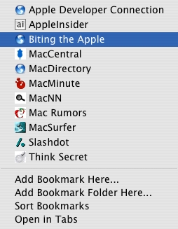
One of the my favorite things it does is add Add Bookmark Here..., Add Book Mark Folder Here..., and Sort Bookmarks menu items to every bookmarks menu or submenu, whether in the Bookmarks Bar or the Bookmarks Menu.

Bookmarks Submenu

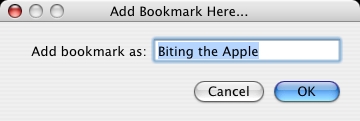
This means no more digging through your entire bookmark hierarchy via the bookmark pane or the less-than-stellar Add Bookmark... dialog provided by Safari. You just open the page you want, use the Bookmarks Bar or Bookmarks Menu to get to where you want it to be, an select Add Bookmark Here.... Easy. Quick. Apple should have thought of this already. After that, a quick dialog comes up that lets you pick the name of the bookmark.

Add Bookmark Here...

Enter the name of your bookmark, hit OK, and you're done.

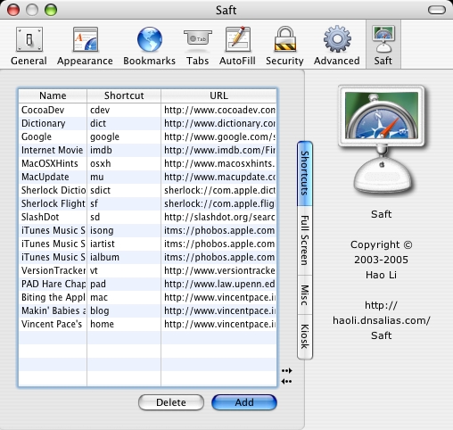
Saft makes going to your favorite websites easier by letting you select short abbreviations (Shortcuts) to represent URLs.

Shortcuts

You type that abbreviation into the URL field, and Saft will replace it with the full URL. For instance, I use the abbreviation "mac" to check up on this blog, http://www.vincentpace.info/mac. This is another great time-saving device.

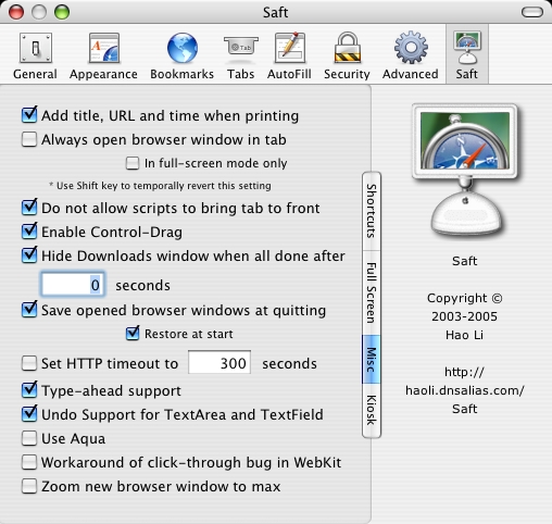
Saft's miscellaneous preference holds a grab bag of good stuff.

Misc

Saft's Add title, URL and time when printing preference will allow you to print out the URL and time stamp when printing out websites. This is standard or most other browsers and yet Apple left it out.

You know those annoying webpages that become the front tab when multiple tabs are open, forcing you to click back to where you were? With Saft's Do not allow scripts to bring tab to front preference, Saft keeps them in their place.

The Enable Control-Drag preference lets you move a webpage up, down, left or right by holding down control while dragging. Apple should really implement this at this system level. As I use SideTrack to make the side of my PowerBook G4's trackpad into a scroll wheel, this largely doubles that function, but nonetheless I find it useful.

Saft's Hide Downloads window when done after x seconds preference will make that damn downloads window disappear when the file's done downloading. How many times have I had to close that manually?

Saft also puts the original URL in the Finder comments of downloaded files, exported PDFs, and saved pages. This feature rocks when you need to cite a source you're using in research and all you have is the PDF sitting in a folder.

Saft's Save opened browser windows at quitting and Restore at start preferences save the browser windows and tabs you have open so that if you quit Safari or if Safari crashes you can resume where you left off. This is a life saver when you have a hundred pages open and Safari crashes; no need to dig through your history to get back to where you were.

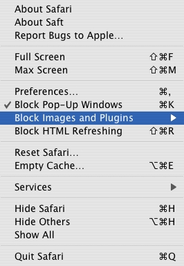
Ever need to use a stone-age dial-up connection, and don't wanna deal with the images or plug-ins? Saft puts the options to not load these right in the Safari menu, so you don't need to dig through the preference pane to get to them.


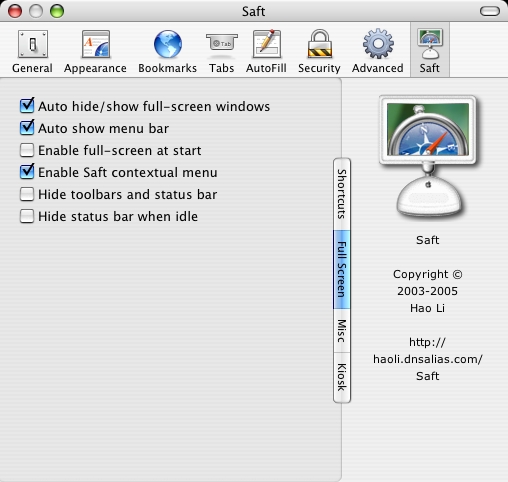
The Full Screen and Max Screen Safari menu items, with options set in the Full Screen preference pane, let you control how the screen is set.

Full Screen

Full Screen hides everything else, including the dock and the menu bar. The dock won't come into view even if you move your mouse over where it's supposed to pop out, although the menu bar slides down from the top when you move your mouse to the top edge of the screen.

Max Screen behaves much like the green dot button in the top left of Safari's window; it aligns the window to the top left corner of the screen and maximizes the vertical size of the window. However, instead of minimizing the horizontal size of the window to just big enough so the horizontal scroll bar doesn't appear, it maximizes the size to the window's width.

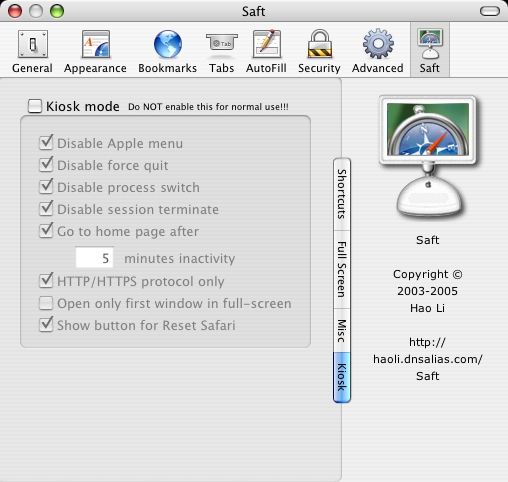
Kiosk mode uses full screen mode together with what is essentially a computer lock down to allow access only to the web.

Kiosk

These are just some of my favorite things about Saft. The list goes on and on, with plenty of features that I don't use. Check out the whole list on Saft's website. I've just begun getting used to Saft and I already feel like I couldn't live without it. Kudos to Hao Li for making such an awesome product and filling in the gaps left behind by Apple.

What I don't like about Saft
I began using Saft with it's shareware version, which is a particularly vitriolic form of nagware that often gives you an annoying pop-up windows prompting you to go to the purchase page right from the get-go. There's no trial period before the nagging starts, which is annoying. I'm guessing it's set up like that because there's no other place to link to methods to pay for the product from the preference pane or elsewhere, without going to Saft's website or reading the read-me file. This would be much improved if there was a nagging-free trial period of 10 or 15 days and an obvious place to purchase the software from Safari's preference pane or elsewhere. After that trial period, intense nagging would seem quite fair.

To purchase the full version, Hao Li actually needs to manually do something, if I'm not mistaken. You send him the money via Paypal and he sends you a link to his download page after having entered you into the system, I think. At the very least, he needs to send you an email telling you where the download page is, even though you can't download it without transaction information. Once there, you have to put in your email and your transaction number from Paypal. Since I bought it on the weekend, it took him a while to get back to me. As I've grown accustomed to immediate impulse purchases of software and music, this was also pretty annoying. This seems like it would be pretty easy to resolve as most other software products I buy have 100% automatic purchase processes.

Finally I seem to have encountered some kind of bug when going from demo to full. Once I got the full version and installed it, the Saft preference pane disappeared from Safari's preferences, although it still behaved based on the preferences I had previously set and Saft's menu items still were there and working normally. I tried to manually uninstall an reinstall Saft as per the directions in the accompanying read-me file, but it didn't work. I sent Hao Li an email to get this resolved. UPDATE: problem resolved.

The bottom line
The things I don't like about Saft are minuscule compared to the things I do like about it. (Not to mention the two things I don't like are not ongoing problems in the software.) Saft takes Safari and makes it much better by adding a ton of functions that you never realized you wanted but will never want to give up once you have them. You gotta wonder how long it's gonna take Apple to implement all the great idea's Hao Li has implemented already via Saft, but until they do Saft is the way to go.

Friday, January 28, 2005

The Ultimate Peripheral

Ingredients
1 iPod Photo
1 digital camera with GPS
1 digital video camera
1 iSync-compatible Bluetooth-enabled phone

Instructions
Gently blend ingredients together in an elegant Apple-like design until they are no bigger than the current iPod. Enjoy immediately.

Tuesday, January 25, 2005

MacJournal 3.0 Suggestion: HTML Preview

Allow an HTML preview of blog entries
When using Blogger's online entry page, there's a button that lets you rapidly switch the view to HTML so you can see if you screwed up some tag and so on. I'd like to see the same thing in MacJournal, although I could be abated in the meantime by it just opening a preview in Safari.

MacJournal 3.0 Suggestions

First, I'll just say that MacJournal is a great program. It's simple and too the point, and does all you need it to do if you're looking to keep a journal or to blog (I'm writing this blog in MacJournal). As I use it for blogging, my suggestions all pertain to that use.

Optionally publish the date the entry was created as the date posted in Blogger
Right now I'm sitting in a train station. In one of my other blogs, I just wrote "I'm in the train station ow..." but as there's not internet connection here I'm not gonna post it until later, which means the time and possibly the date is going to be inappropriate. Right now the workaround is to log in to Blogger (and LiveJournal I assume) and manually change the date.

Note if and when a blog entry was posted
As is, there's no way to tell from within MacJournal whether you posted a blog or not.

Note if a blog has been edited since it was posted and if reposting, delete previous entry
This will save the effort of having to log in to the blogging service and delete the blog yourself.

Designate a blog for a given journal
As is, each time you post a blog entry, you have to select the blog to which it will go (unless it's the same as the last blog entry). However, I have a separate journal for each of my blogs and it would be easiest if I could do one-click publishing instead of having to click the Blogger icon, select the blog from the pull down menu, and pressing return. This would also lessen the risk that you post an entry to the wrong blog.

Make it easier to change the time.
I'd like to see it right in above the entry below the topic entry. I often write a blog entry for the day before on the morning after and it'd be nice if I could date it without having to dig up the date from a menu or key command. This is also useful if you want to bring journal entries in from somewhere else.

Sunday, January 23, 2005

Mac Mini: Lack of USB Slots After Mouse + Keyboard?

I was just taking a look at the Mac Mini and something struck me. Apple's got these two pics up on the Mac Mini webpage.


Notice that in the first picture you see the USB keyboard and mouse going to the back with separate wires and presumably needing separate USB slots. Then in the second picture you can see that there are only 2 USB slots in the back. (As an aside, the pics also seemed to be aligned in different ways, with the top having USB on the left when facing the slotted side and the second having it on the right.)

So... what do you do when you have to use a USB slot for something else, like a digital camera or a printer? Deal without the mouse or without the keyboard? My guess is that that's pretty unlikely, but I'm not coming up with any way around it just by looking at the Mac Mini webpage. Am I missing something here?

iPhoto 5.0 Suggestion: Name Main File of HTML Export

Allow user to choose name of HTML file of album exported to HTML
Currently, iPhoto makes the main file the same name of the folder it's in. So if you export an album to a folder called mypics, you'll have to go to mypics/mypics.html to get to the main album page, and the URL would have to be something like http://www.mywebsite.com/mypics/mypics.html. However, if you could choose instead to set the name of the main file to index.html or default.html, you could simply type in http://www.mywebsite.com/mypics. Naturally you can edit this manually to get the same result, but it'd be simple enough for iPhoto to save us the trouble.

iPhoto 5.0 Problem: Can't Import AVI Files

Upon trying to import some AVI files into iPhoto, I got the following error message:
Unreadable Files: 1

The following files could not be imported (they may be an unrecognized file type or the files may not contain valid data).

/Users/vincentpace/Desktop/RMOV0001.AVI
This is particularly puzzling because Quicktime Player opens the movies with no problem. Moreover, previous video clips that I've made on the same camera with the same settings (I've never touched the video settings) have been imported, although these are the first ones that weren't on my computer before I installed iPhoto, although I can't see how that would be relevant.

A quick google search reveals that this error message has come up before in earlier versions, but all the fit-its are for pics and not videos, so I'm not sure what to do. If anyone has a clue, please give me a hollar.

iPhoto 5.0 How-To: Recover iPhoto 4.x's "Recovered Photos"

iPhoto 4.x did this weird thing where some photos, with no apparent pattern, were placed a "Recovered Photos" album. However, they were not recovered at all and were actually corrupted. In my Recovered Photos album, there were 77 photos and only 3 of them would display anything, and those I couldn't do any more but see the thumbs.

I tried the rebuilding the library fix, but it didn't work so I developed the following workaround. However, this requires a pre-corruption back-up, which limits it's utility to those of us who are lucky enough to have one of those.
  1. Open ~/Pictures/iPhoto Library/AlbumData.xml in a text editor.
  2. Find "Recovered Photos" in AlbumData.xml.
  3. Copy and paste to another text document the list of numbers below between the <array> and </array> tags. Each of these will have it's own <string> and </string> tags surrounding it.
  4. Find "<key>" + one of the numbers between the <string> and </string> tags. This will display the actual data of the photo represented by that number.
  5. Within the photo data, you'll see a location that looks something like /Users/vincentpace/Pictures/iPhoto Library/2004/10/03/myphoto.jpg. Copy and paste this somewhere. This is how you'll be able to find the photo in the back-up. Be careful not to use the other locations, such as the location of the thumb or the original if it was edited. I simply copied everything that was between the <dict> and </dict> tags.
  6. Using that location which contains the name of the file (myphoto.jpg) and the date of the file (October 3, 2004), you should be able to find it in your back up, especially if the back up was just a back-up of your iPhoto folders.
  7. Delete those damn Recovered Photos from iPhoto.
This workaround frankly sucks, but it at least gets the photos back for you.

GPSPhotoLinker: Manually Put GPS Coordinates into Photos

So I sent off an email to Jeffrey Early about his program GPSPhotoLinker that I mentioned yesterday, suggesting that he implement a means to manually input GPS coordinates into photos and address look-up or click-and-point mapping.

Kudos to him for getting back to me in just a day. He's gonna be releasing a new version this week that will let you put it in manually, even if not the most direct route.
Later this week I'll release a new version I've been working on that will allow manual saving of tracks and waypoints to photos. This would at least give you a fairly painless method for manually entering coordinates because you could edit the GPX file directly and change a waypoints latitude and longitude.
Looking forward to it.

Saturday, January 22, 2005

Suggestion: Put GPS in Digital Cameras

I'm dying for this. As I said before, iPhoto could mark the location with this. If you have a GPS track file that you can match up with the coordinates of your camera, GPSPhotoLinker will input them into your files. But as far as I can tell no digital camera has implemented this directly. (Someone correct me if I'm wrong so I know what my new camera is going to be.)

Being in touch with a GPS satellite would solve another problem of mine... time zone switching. I travel often between Asia and the east coast of the United States. As such, I often forget to change the time in my camera and the time recorded in the pics ends up being about half a day off from the actual recorded time. A camera in touch with GPS satellites would know where it was and would be able to automatically switch the time zones so I would never have dinner pics that are recorded at 5AM.

iPhoto 5.0 Review

I was ecstatic to hear that iPhoto 5 was going to be able to handle video clips and would have nested folders, I went out and bought it right away. I was recently carousing the market for a program that could organize all those little video clips, so I was glad to hear a program I would probably end up with anyway had it.

So here's what I dig about the program:
  • Ability to handle video
  • Nested folders
  • When you hold down the option key, the Rotate button switched from one way to the other. No more triple-clicking to get a pic the way you want it.
  • You can list the number of pics in a folder or album via a preference selection.
I'm not sure if the last two are new or if I just never noticed them before, but they're welcome improvements.

I did have some problems with it, however.
  • Those weird corrupted files from my past upgrade continue to cause problems. They made the program take so long that I thought it had crashed. (It was actually just taking forever.)
  • The photo in the edit view appeared in the wrong place, partially covering the folder pane of the window. This happened twice in a row and then I couldn't get it to happen again.
And as usual I have a list of suggestions for improvement...

Make videos viewable without launching Quicktime
If Safari can do it, iPhoto should be able to too.

Allow encryption
We've got some pretty personal pics from the birth of my daughter and my wife wouldn't be to happy to hear if someone chanced upon them while looking at our pics in iPhoto. (And this kind of things goes double for all those porn hounds out there.) iPhoto should be able to password protect folders, albums, smart albums, rolls and the individual files as well. If a folder, album, smart album or roll is protected, all files within (and all previous versions of the files if they exist) should be protected as well, no matter where else they can be found, ideally including in the Finder.

Mark as private option
This would be ann addition to the meta-data that's already there. This could be encrypted as well, but the main thing I'm thinking of using it for is preventing unintentional export. Take the birth pics again... if I put them in an album that's functioning as my daughter's baby book and I want to publish that on the web, it'd be nice if those private pics were skipped. Alternatively, this could be folded into my encryption suggestion above, in that encrypted pics would simply not be published.

More meta-data
Right now a convenient work around to additional meta-data is the comments field. However, I'd like to see a Location, Photographer, and People fields. All three of these could be integrated with Address Book. For instance, with Location, you could type in the name of a business in your Address Book and add it in. Ideally, the Location would look up latitude and longitude based on address, and hopefully digital cameras will incorporate GPS sometime soon.

Friday, January 21, 2005

iCal 1.5.5 Suggestions

Implementations of events that start in one time zone and end in another
I'm thinking mainly of flights. Let's say I start in Tokyo and fly to New York. This will usually actually result in me going back in time as far as date and time is concerned. For instance, I'm flying from Tokyo to New York on August 13. I leave at 3:55PM and arrive in New York at 3:20PM. The easiest way to handle this is to put the departure time in the time zone of where your departure is and then calculate out how long it will be. If you calculate it correctly, you should end up in New York at 3:20. However, this is something of a pain. It would be easier if you could just set the beginning time for one time zone and the second time for another.

Allow nested to-do items
Let's say you've got to "Write report on this year's sales." There are several distinct steps, such as "Write first quarter summary," "Write second quarter summary," etc. Instead of having each one separate and disparate throughout the calendar, having the organized hierarchically in terms of the entire project is just a much neater way of going about things.

When sortings by due date, you will sort based on the earliest uncompleted due date within the nested to-do item. When by priority, it will be by the priority of the highest item within. When by summary, it will be just like folders in the Finder, sorted by the highest level item.

More checkbox versions
Currently all you have is unchecked (not done yet) and checked (done). I'd like to see some more options. The thing I would most like to see is an "x" for "not done," as in decided not to do at all. With nested to-do items, if the child to-dos consist of one or more of the following, then the parent to-do will display the following ("_" is unchecked, "√" checked, "x" is x-ed, "-" is dashed):
Child   Parent
_       _
√       √
x       x
_, √    -
_, x    -
_, √, x -
√, x    √
Allow editing of priority menu for to-dos and status menu for calendar entries
Currently the priority menu gives you a choice of nothing, "Very Important," "Important," or "Not Important," while the status menu gives you the choices of nothing, "Tentative," "Confirmed," or "Cancelled." At the bottom of each of those lists should be an "Edit menu..." entry which will open a window that will let you add or take away menu items, including assigning icons to them. The one I'm especially eager to have is "Skipped" for classes, as this isn't quite the same as "Cancelled," which has been standing in for it thus far for me.

Allow multiple URLs
If there's some logic for having just one URL, the first URL should be treated specially if necessary. Otherwise, the user should be allowed to input multiple URLs.

Allow color customization
It's hard to see at times with the current color schema.

Allow linking of the location field and addresses in Address Book
If this links to a person's house, it could show their address. If it links to a company (for instance a restaurant), it could show the name of the company and the specific address information.

Allow carriage returns in the location field
The work around now is to copy and paste an address with carriage returns from some other field, such as the notes field. If you don't do this, the address must al be written on one line.

Automatically put b-days, anniversaries, etc., in the calendar
As I've noted in my comments on Address Book, there should be a checkbox in Address Book to decide whether or not to post a date. Birthdays should optionally end on a death date, and wedding anniversaries should optionally end when both people have died.

Sort to-dos manually
In addition to the three to-do sorts, they should also be sortable manually.

Set date to-dos are first visible in the calendar
Currently, the only view option for present and future to-dos which have not been completed is "Hide To Do items with due dates outside the calendar view. Frankly this is a rather blunt too for siphoning out what to see and what not to see. You may have something due in three months that you need to start work on now, or you may have something due in three months that you can't work on until a week before it's due. Thus, above the due date in the to-do item info drawer, there should be a "show after" date selection item, where the user may select the date after which an item is shown. It could have a check box just like due date. If it is not checked it will follow the default rules. If checked, you will only see it when looking at a part of the calendar which is after that date or if the actual date is after that date.

Show completed to-dos between show after date and due date
As is, you can either hide to-dos a certain number of days after completed or show them all, yielding an unwieldy list. Assuming the above suggested is implemented, this would allow you see to-dos only when they were relevant on the calendar, rather than just having a massive list to scroll through.

Make all-day items take us less space in week view
The current priority seems to be keeping all-day items in the same position across weeks, rather than taking up less space. For instance, the week I currently have open displays like this, with each number representing a different all-day entry:
 MTWTFSS
Row 11   2  
Row 2  33333
Row 3     4 
Row 45555555
Row 56      
However, this could take up only three lines if displayed like this:
 MTWTFSS
Row 11   24 
Row 26 33333
Row 35555555
I think saving screen space is more important than maintaining all-day calendar item row consistency over the weeks.

Allow scrolling through week view day-by-day
Currently you can only go week-by-week. If I want to compare the schedules of the last day of the week and the first day of the week, I either have to flip through weeks or else change the start day of the week each time I want to do this.

A second icon, one for forward and one for backward in time, could be added to the bottom of the calendar where you can click on the icon to move the calendar view forward or backwards. So there would be two sets of icons, one for a weekly jump and one for a daily jump. A second key command could also be added to cover the difference between the daily and weekly jump.

Allow changing the number of days displayed in week view
I would say the range permitted should be from 2 to 14, with the default naturally being 7. There should be a button to add or subtract days from the week view in the interface. A simple + and - à la Palm Desktop would do the trick nicely.

Allow calendar publishing of all calendars to one single calendar on .Mac
For instance, I have a calendar for a work and a calendar for family things. When I give my .Mac calendar URL to a friend to schedule an event, he'd want to see all my events in one place and not have to look at two different calendars. This function still isn't available.

Tuesday, January 18, 2005

Address Book 3.1.2 Suggestions

Fix the undo function
Currently when you are working within a card and you hit undo it takes the card back to the state it was in before you started editing it at all. This is a huge pain in the butt when you just entered a bunch of data but you accidentally deleted one thing and just want to undo the last thing. This seems more like a bug that needs repair than a request for a feature, as it's just so obviously stupid.

Allow multiple URLs on each card
It seems very strange that the number of URLs is limited to just one. Both people and companies often have several related websites, so it seems patently strange to limit this to just one item.

Make a checkbox for old items
Let's say a friend changes his email. If you delete his old email from Address Book, Mail will no longer connect saved emails from his old email with his Address Book entry. For this reason, there should be a check box that lets you designate an email (IM name, address, phone number) as no longer in use. An item so designated should not appear as an option in Mail and other programs that call on data stored in Address Book. It should be visible in Address Book only in edit mode.

Some kind of system for linking a contact to related data and files
The most obvious candidates for this are emails and iCal entries in which the person is linked, as well as photos in iPhoto, iChat saved chat files, iTunes songs or playlists, etc. This could by splitting the data pane and essentially having a Tiger Spotlight-like search displaying emails, iCal entries, chats and so forth in the bottom part. There should also be a way to link related files, such as PDFs, MS Word documents, etc., that would show up in the same place. And it would be great if any file with this person's name in it could be included. This would make Address Book the one-stop needed to find anything related to a single given contact.

Make it faster
Whatever was done to make iPhoto a helluva lot speedier needs to be done to Address Book. The spinning ball pops up quite often.

Add birthdays and other dates to the calendar
While rumor has it birthdays are to be added in Tiger, let's not forget anniversaries and the other dates that can be added. There should be a checkbox next to each date to specify whether or not it should be included in iCal.

Birthdays should be started on the year that the person is born. In the section that allows other dates, "Died" or something similar should be a default date, and birthdays should optionally stop after this. The preference could be something like "Do not list birthdays of people who have already passed away."

Allow nested groups
This could be implemented just like the mail folders in Mail. You could have a "Work" group with people like the secretary who may not fit anywhere else and subgroups like "Marketing" and "Sales."

Smart copying of addresses
There seems to be no way short of copying an entire card to copy all the elements of an address without doing it one at a time. When selecting the address type, there should be an element "Copy address." Then if you paste it into another document it should come out as a multi-line address. If you paste it into any address field in Address Book, it will replace whatever was there before with the entire address that was copied.

Automatic country selection
Instead of requiring that the country be selected from the "Change Address Format" submenu in the address type pull-down menus, the format should change automatically based on whatever is listed in the country field.

Allow reorganization of items
As is, things are just listed in the order you enter them. This is a pain, for instance, as Mail by default simply selects the first email of a contact. You can work around this by reordering things by cut and paste, but this is a huge pain. They should be sortable by 1) alphabetical category order, 2) alphabetical data order, 3) user-selected category order, 4) manually, or 5) most recent use.

Allow more space in date fields
Currently items are cut off with certain date formats. Using my custom date format, for example, dates read something like "1939 May 06 (", which should be followed by the day of the week and the end parenthesis.

Allow more subdivisions for organizations
Currently all there is "Company" and "Department." It would be much more useful with big organizations if it were "Organization," "Subdivision 1," "Subdivision 2," etc., with the same green + sign used to add additional entries to other places.

Store contact photos in an iPhoto album
As is, there's no way to edit a photo once it is in the card and they are stored in some strange format. Address Book should take the easy route and store them in some format that can be accessed via iPhoto.

Allow easy changing of contact photos
The photo switching implementation in iChat seems perfectly suited for this. It would store any image that was associated with the user, including pics that the owner used as well as pics included in an imported vCard or sent from the contact via iChat.

Automatic relational linking
If V is listed as A's son, daughter, or child in A's card, then A should automatically be listed as V's parent on V's card instead of having to do everything separately in each card. There should be a range of automatic pairs: father/mother-child, son/daughter/child-parent, friend-friend, partner-partner, spouse-spouse, etc. There should also be a way for the user to create new automatic pairs. For instance, at my school the upperclassmen can mentor lowerclassmen, creating a mentor-mentee pair.

Add an extension field to telephone numbers
As is, extensions must be included as part of the number. While this is a reasonable work around, it would be preferable if it were a completely separate field.

Calculations related to dates
Next to birthdays, Address Book should calculate the current age. (24 years old)

In a contact with both a birthday and a date of death:
  • Next to birthdays, Address Book should calculate the would-be age (Would be 24 years old)
  • Next to date of death, Address Book should calculate age at death and how long ago the death was (1 year ago at age 23)
Next to other dates, Address Book should calculate how many years ago it was (24 years ago).

Address Book should calculate the age for easy reference. If there is a "Died" date, iCal should calculate next to that the age at death and next to the birthday "Would be X years old" or something similar.

Allow partial dates
You should be able to add 1) a year only, 2) a year and a month only, 3) a month only, or 4) a month and a date only. In the case of the 1)-3), they should not be placed in iCal. In the case of the 4), it should be placed in iCal with no start or ending date (the user may add one if so desired). In the case of 1) and 2), iCal should make calculations as normal, using the first of the relevant year or month as the base date.

Edit default pull-down menus
The pull-down menus for type of phone number, email, etc., should be customizable instead of each time having to add a new custom item. Instead of just "Custom..." there should also be an "Edit menu..." option.

Fix the bug when you type over an autofill
When you are typing in a field, say a relationship field, and you type in "Bill" when you already have a relation in a relationship field that starts with "Bill", Address Book will insert the rest of the email in front of what you're typing, letting you use it if it's what you're about to type, or, if there are multiple relations that start with "Bill", it will give you a pulldown menu to pick the one you want. This is great. The problem is that if the thing is not the one you want your typing will often get screwed up. A few letters will get switched out of the order you type them in as the computer thinks about the autofill. This needs to be remedied.

Friday, January 14, 2005

Mail 1.3.9 Suggestions

Allow selection of multiple emails per contact in the Address Book email selection pane
As is, you can only select one email per person, even when holding down the apple key or the shift key. This is useful if you're not sure which email the contact will see first or if you're not sure which email is current. The current pain in the butt workaround is to add the email and then go back and click again to add the second.

Apply rules to sent emails
As is, if you want to have rules applied to sent emails, you have to go to the sent folder, select all, and select apply rules from the message menu. This should be automatic or else it should be a preference: "Apply rules to sent emails."

Make it possible to hide Out / Drafts / Sent / Trash / Junk
These do not always need to be in view. Menu items in the view menu or a submenu thereof would do the trick nicely.

Move Trash and Junk to the bottom of the drawer
They should be listed at the bottom below user-created folders so that more important things can have higher prominence.

Organize rules with nested folders
As is, you just end up having a very long awkward list if you use a lot of rules. Folders would make things a heckuva lot easier to deal with. The order of rule implementation wouldn't change... you would just open the folder and take things in the order they are in inside before going on to the next item.

Make a tool bar button for Apply Rules
This is one of the few things I have to dig through the menu for again and again.

Ability to add and remove emails to and from threads
Right now emails with exactly the same subject may be threaded together even when they are not related. For instance, "Re: hey" is a common email subject among my friends and they often end up bunched together even when totally unrelated.

This could be implemented in a very simple way. If you want to thread one email with another, drag the email to be threaded to the other email. If that email is already in a thread, the added email will become part of that thread. If you want to thread two threads together, drag the header of the thread to another email in the other thread. If you want to remove an email from a thread, simply drag it out of the tread onto another part of the mail window. You should be able to use select and command to select multiple emails for the same treatment.

Add an email to an existing contact in Address Book
As is, the only thing you can do with emails and Address Book is "Add to Address Book," which creates a new contact in the address book. However, often an email is received from someone already in your address book and no new entry is needed. Thus an "Add Email to Existing Contact" function should be added to the email drop-down menu. This function should open up the Address Book window to select the person you're looking for, the the "To:" and "CC:" buttons replaced by "Add". If the email is sent with a name, that name should be automatically entered in to the Address Book pane search field, which is where the cursor should automatically go, highlighting the entire field so you can readily type in it.